Design Lead
Logo Design
UI Design
Web Development
HTML / CSS / JavaScript
Collaborators
Hui Ser Choo (Team Lead)
Gordian Mok
Mahsa Karim Fard
Jerrin Mazhuvancherry
PROJECT OVERVIEW
Aroma Ristorante is a fictitious Italian restaurant that serves modern Italian cuisine. Our emphasis is on simple dishes made with care and the best ingredients.
For this team project, we was required to use only HTML, CSS and pure JavaScript.
MY ROLE
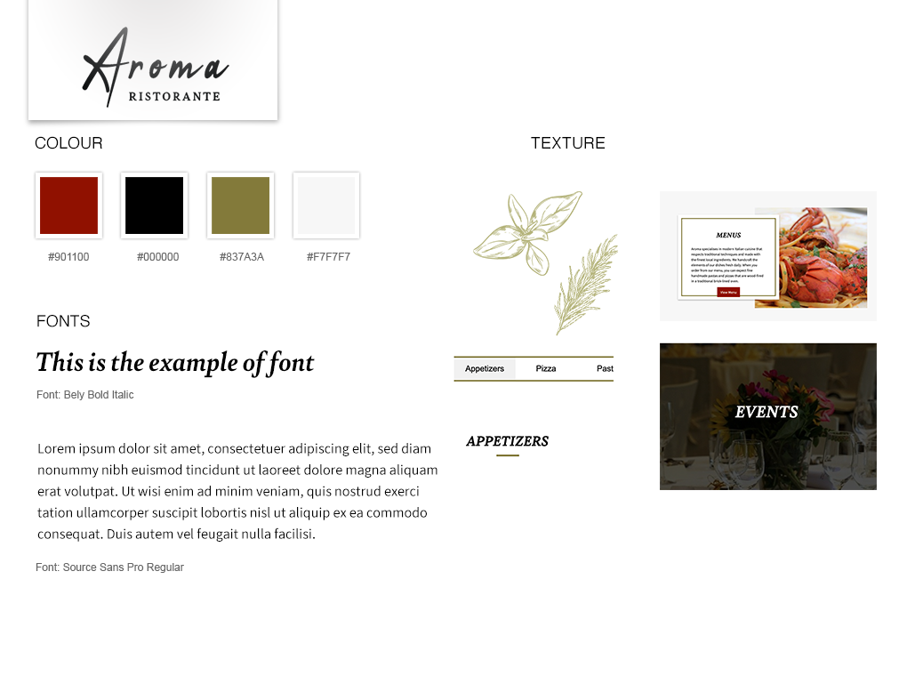
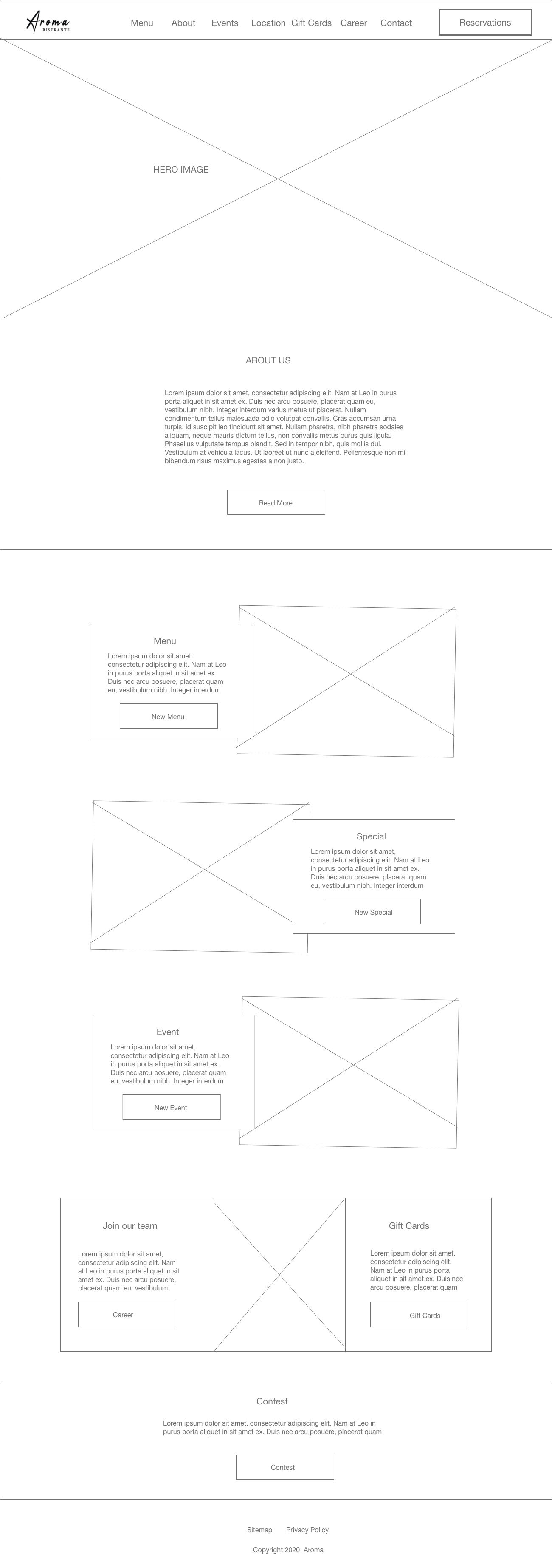
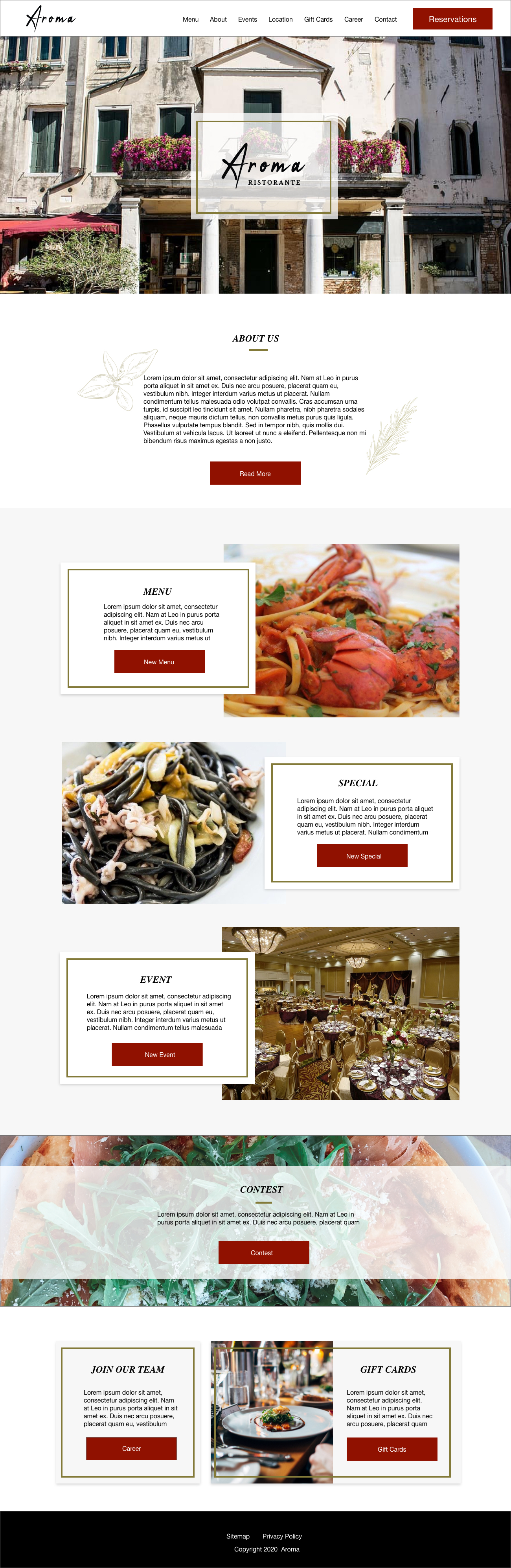
As a design lead, I created a wireframe, the logo and style tiles first as design guide.
Then I created the global CSS file which helps all pages look consistent.
I was responsible for building the template and home, menu and event pages.
Requirements and Our Solutions - This project is required to create 11 pages
Home:
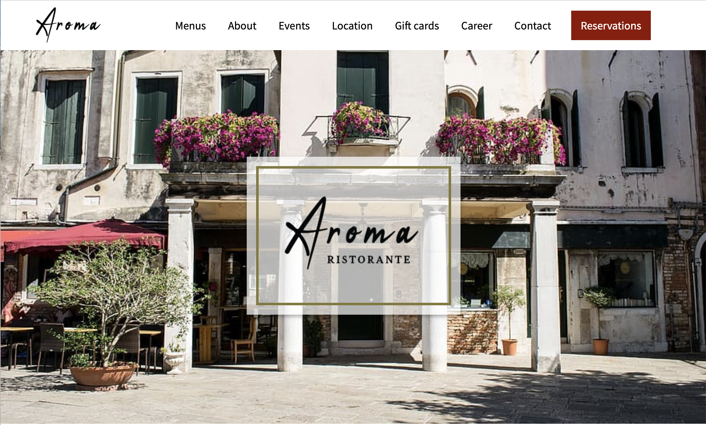
Home Page is overview of the each pages, Call to Action redirect to individual pages.
About Us:
Using the same card design on the homepage. Subtle scroll animation make the website elegant.
Menus:
Aroma provide 5 categories of regular menu items. Using tab to show them.
Specials:
Using the same layout used on Menus page.
Events / Booking:
Event page describe about the information for the venue. Inquiry section has a button to call to action to the form.
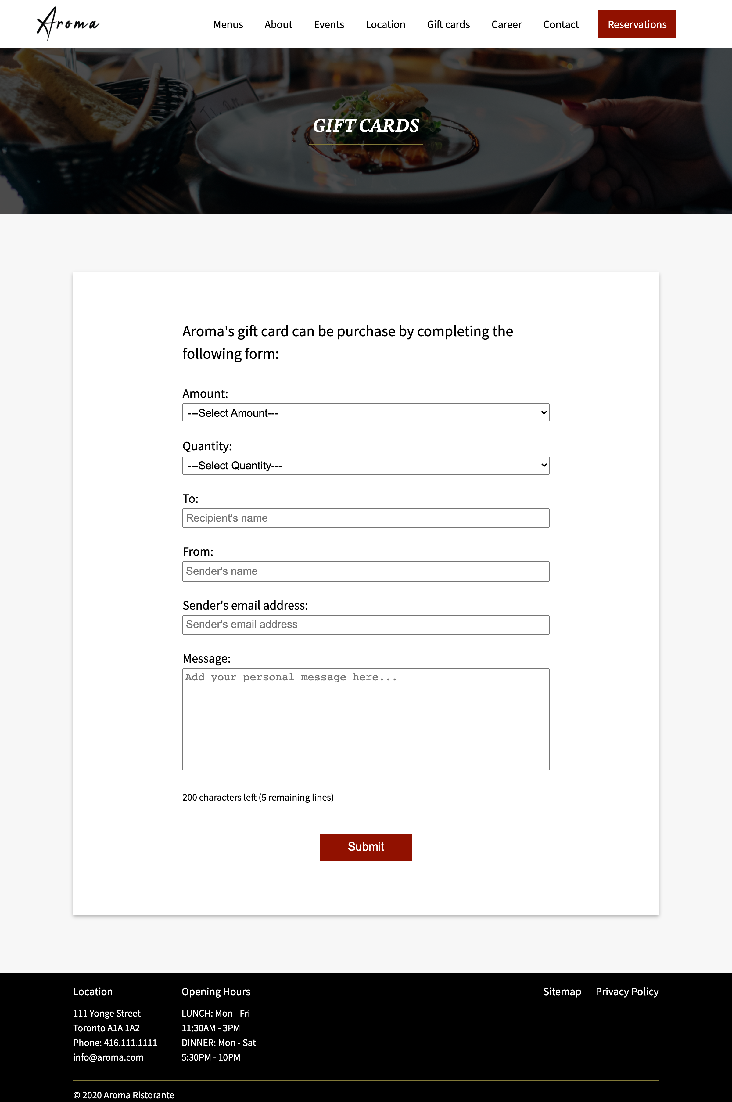
Gift Cards:
Gift card purchase form.
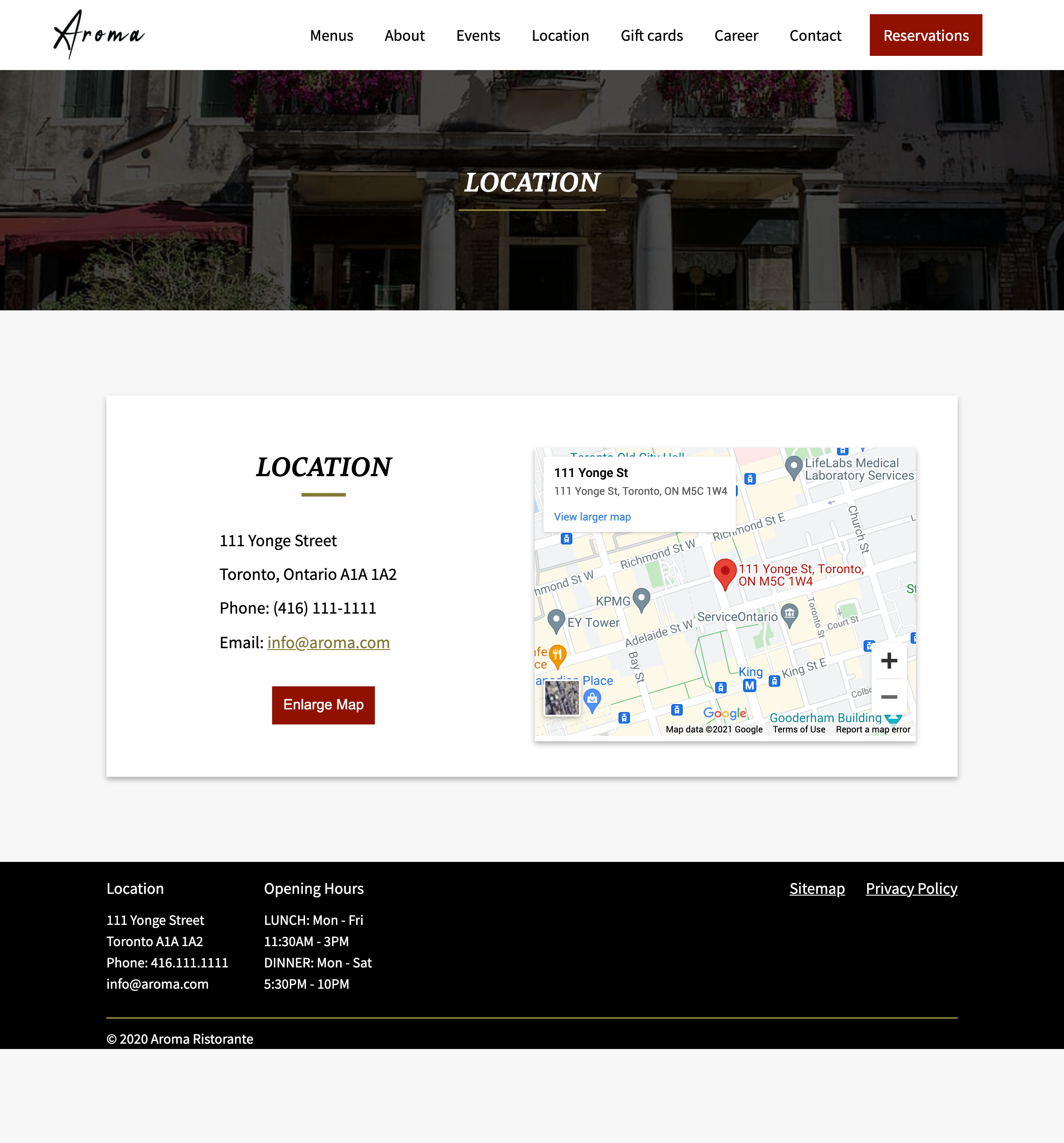
Locations:
Restaurant location information with Google Map API
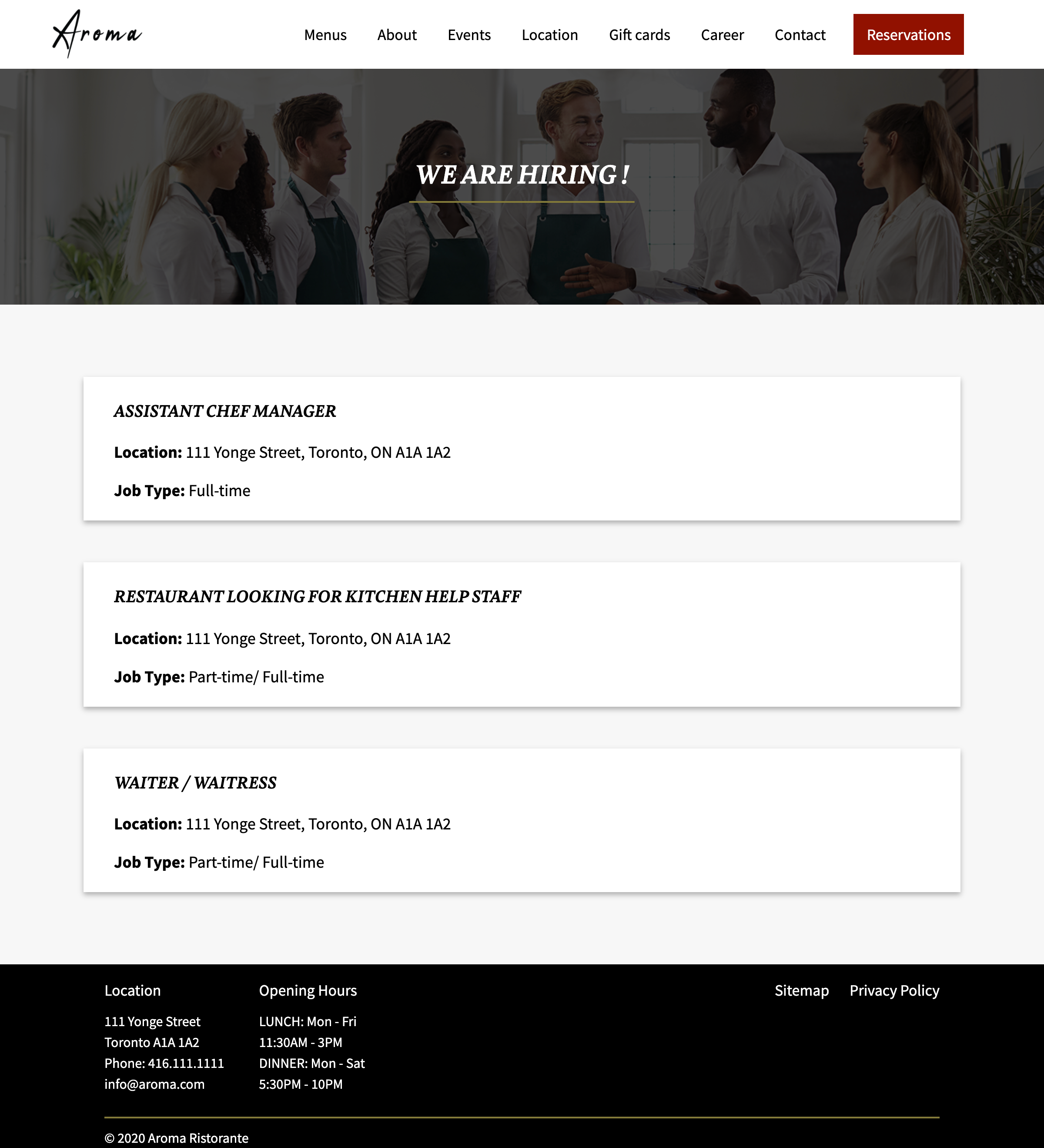
Careers:
Clicking the card describing the job title, location and job type, expand the accordion to show the job description.
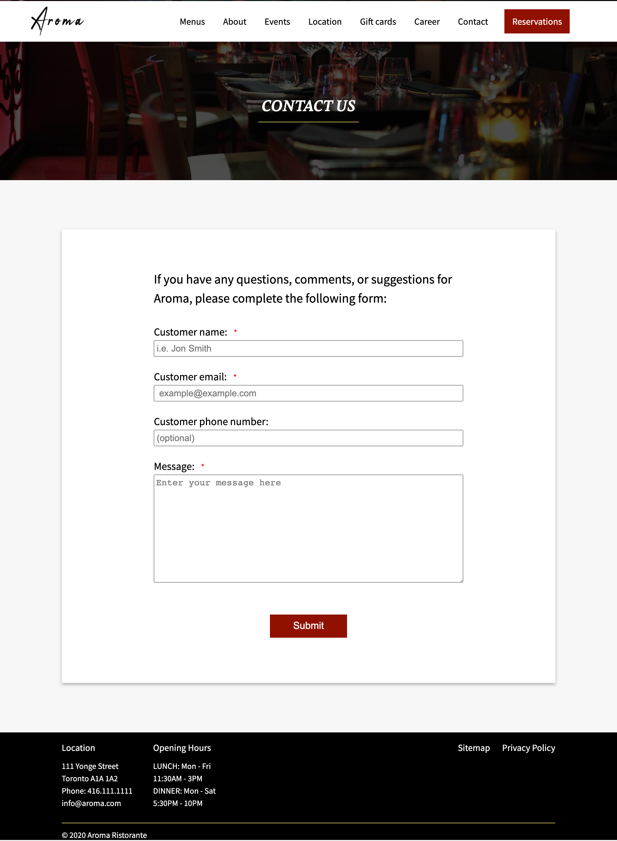
Contact Us:
Conatct Us form.
Contest:
No winner game - create cards, pick cards with food images.
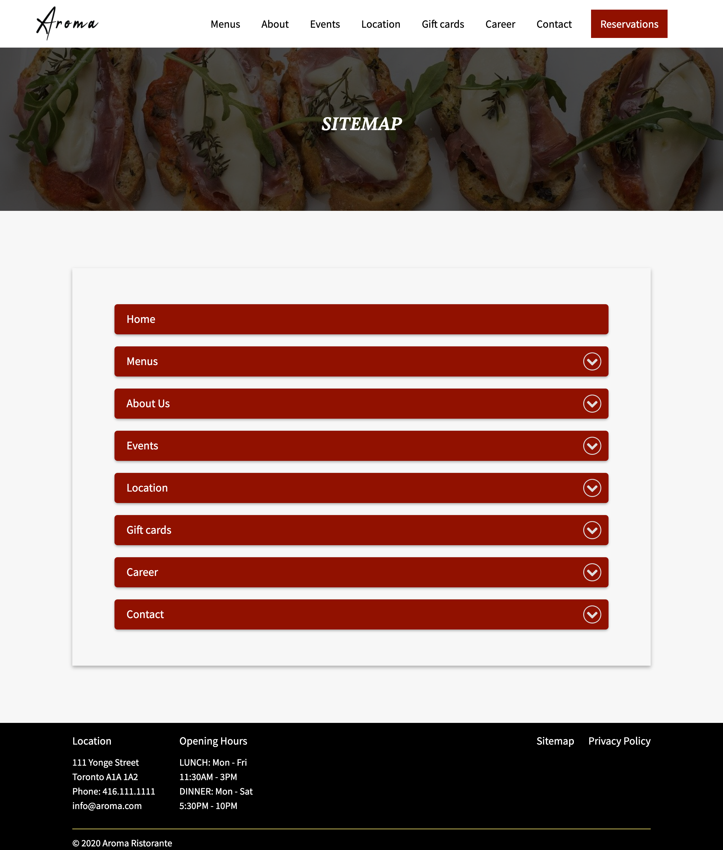
Site Map:
Accordion - expand folder content
Design Decision
Colour:
Our website is white background with gold, crimson red and black as accent colours. The reason for the website background colour white is because we used a lot of images including food and venues. White background is simple and enhance these images especially food images looks fresh and delicious.
Using Gold Colour for borders of the cards, underline of titles gives impression of royalty and a high standards or class since Aroma is Michelin stared Modern Italian restaurant and mainly customers go to the special occasions. Using crimson red and black colours for buttons since combinattions of these colours denote sophistication and stand out with white background.
Layout:
When I thought how to enhance the images on the website, I came up with the idea to use two columns on the features sections (Menus, Specials, and Events). Contents and images are slightly overlapping. However, the using the box with shaddow design looks more elegant than without it as well as giving the softer impression. The contest section on home page is using paralax with partial white transparent content area, which is eye chatching since this section has an important role for the website since this is the only way to visit the contest page. Based on this home page, card style (shadow with gold borders), title with gold border are used.